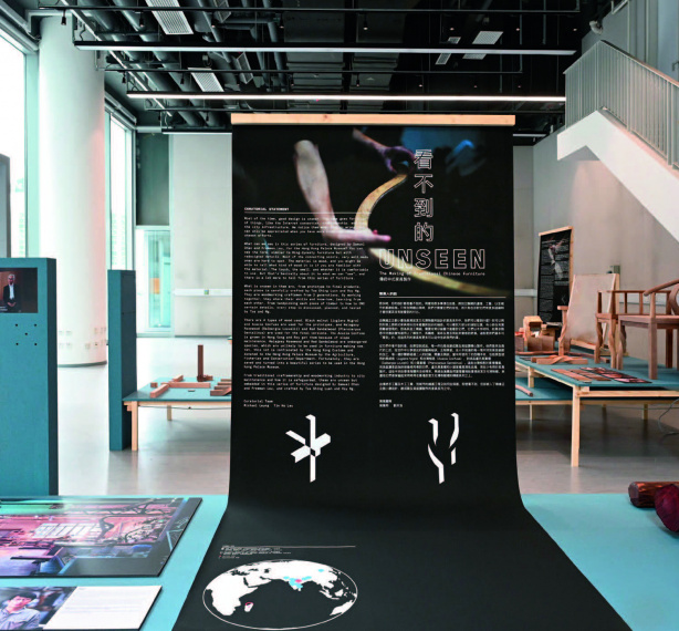
To revisit the "See Words__" exhibition that was successfully held in July at the Centre for Communication Design of HKDI, we invited three key persons of the show and discussed how they perceive the potentials and the future of typography in Hong Kong.
Typography and its related information can be seen everywhere. To collect, categorise and put the relevant information in order would be a labour of love. We hope to set up Typeclub such that the public can become more interested in this unique visual art," said Benny.
Typeclub brings together like-minded friends in the design community and envisions to tell the story of using texts in design, to broaden the scope of imagination and to inspire creativity before the importance of typography is completely forgotten. The association is committed to organise exhibitions, seminars, workshops and other events such that different sectors in Hong Kong, the Asia-Pacific and beyond would be more aware of typographic design. From there on, the craftmanship of this visual language can be promoted and innovation can be inspired. The ultimate goal of Typeclub is to deepen the public's awareness about the function of typography and design.
The why's of "See Words__"
We do not need to look far to spot typography at work. Artistically placed texts are omnipresent on commodities, signboards, and even attention-seeking social media images and videos. Yet, we do not always truly appreciate what we have until it is gone. Some Hong Kong native typographic designs, for example, the calligraphed minibus signs, stencilling on trucks, and the one-of-a-kind font used on road signs produced by inmates, were never talked about until they became rarities. The recurrence of this sudden urge to preserve locality is solid proof that Hong Kong needs to gather scattered traces of typographic designs and make sense of them. Seeing the opportunity to do just that, Typeclub collaborated with the Centre for Communication Design of HKDI and organised "See Words__", hoping to invite more people to take a closer look at the aesthetics of typography, such that more typefaces that are uniquely Hong Kong can be uncovered.
The nine founders of Typeclub – including Spencer, Benny, Katol, Victor Cheung, Henry Chu, Sammy Or, Sandy Choi, Dave Choi and Keith Tam – each invited two friends to take part in "See Words__". By looking at the more than twenty works that all designers put together, visitors could take time to connect to this visual art and learn that there is much more than typeface, fonts and font size in typography. The projection, installation, illustration, posters, and books shown also encouraged visitors to reflect on the interweaving relationship between the artistic visualisation of texts and the various aspects of space.
Spencer shared, "Typefaces never exist on their own but co-exist with specific functional spaces. People have been too focused on the vary narrow screens of smart phones in recent years. We hope that 'See Words__' could lure phone users to take their eyes off their little screens and really look at more expansive spaces around them."
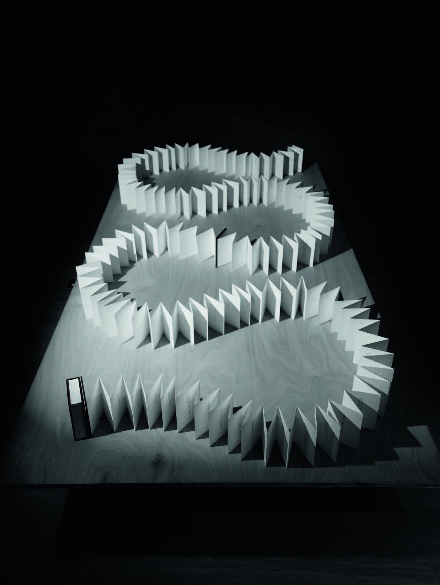
Benny quoted the work of Dave Choi as an intriguing example of this mission. See the Words, Illustrate into a Bible offers a fun angle to appreciate typefaces. Resembling a collection of butterfly specimens, the wall chart comprises the typographic materials that Dave collected from different corners of Hong Kong. Systematically arranged insect specimens are used to represent the countless typefaces around the city, which are otherwise easily overlooked.
Signboard design specialist Katol brought an installation See the Words, Worths Thousand Ounces of Gold to the exhibition. His hand-painted gold leaf sign is an oversized book with its contents written with gold leaf. It is a symbol that Hong Kong is a trusted brand, and its promises are as valuable as gold. As a younger founding member of Typeclub, Katol sees typography as the work of an artisan. He is honoured to be able to make a living out of this declining local craft. Katol commented, "More and more people are engaged with typographic designs over the past few years. It is reassuring to see some Instagram accounts are dedicated to collecting images that feature beautifully designed texts in our city."
Katol also noted that typographic elements have been applied by people who are not working in the design industry and those who have never received formal training in the area. His invited artists, graffiti influencer XEME and rapper Youngqueenz, never formally learned about typography, but their graffiti and music videos are filled with astonishing typographic details.
Looking into the future
"See Words__" offered pleasant surprises by converging creative minds from different domains to express their love for Hong Kong native typefaces. On top of showing current HKDI students the all-encompassing world of typographic designs, the exhibition also helped Typeclub to improve its visibility and to share its vision and mission with the industry.
Spencer said, "Of course, it takes more than one exhibition to create a new trend, but we hope this will be the first of many bigger and better exhibitions. We look forward to connecting more people who are interested in this visual art. With a stronger presence, we may even venture outside Hong Kong and work with other regions." Spencer believed that education is an important tool to keep great legacy alive. Incorporating typographic elements into formalised design programmes would be a desirable development, as this could help the new generation to learn more about fonts that are unique to Hong Kong.
Benny added, "I hope 'See Words__' could show something different to those who consider typography boring. I also hope that emerging designers will be inspired to practise and experiment with the works presented." In fact, taking time to practise and experiment is crucial in the learning process. Students must also understand the creative journey of designers and reflect on their own experiences before they could develop their own personal styles.
Katol agreed that practice is key and there is more to explore than formal training. For example, he has learned and practised many creative techniques from some Hong Kong typography designers he encountered online. He reckoned many youngsters are doing the same and he looked forward to the continual development of the online platform, where more young designers will be nurtured.
Our three guests also talked about the importance of developing new font families fit for on-screen and on-paper reading. Certainly, the spirit of an artisan and the help of advanced artificial intelligence are needed to create a new Chinese font family. After all, the quantity and variation of traditional Chinese character set is thousands of times larger than the 26 letters of the English alphabet. The Japanese way of honouring the craftmanship of seasoned masters and to incorporating new elements to create new culture may shed light on how to achieve this goal.
|